¶ Data Visualization Dashboards
¶ 0. Intro Video
¶ 1. Roadmap Overview
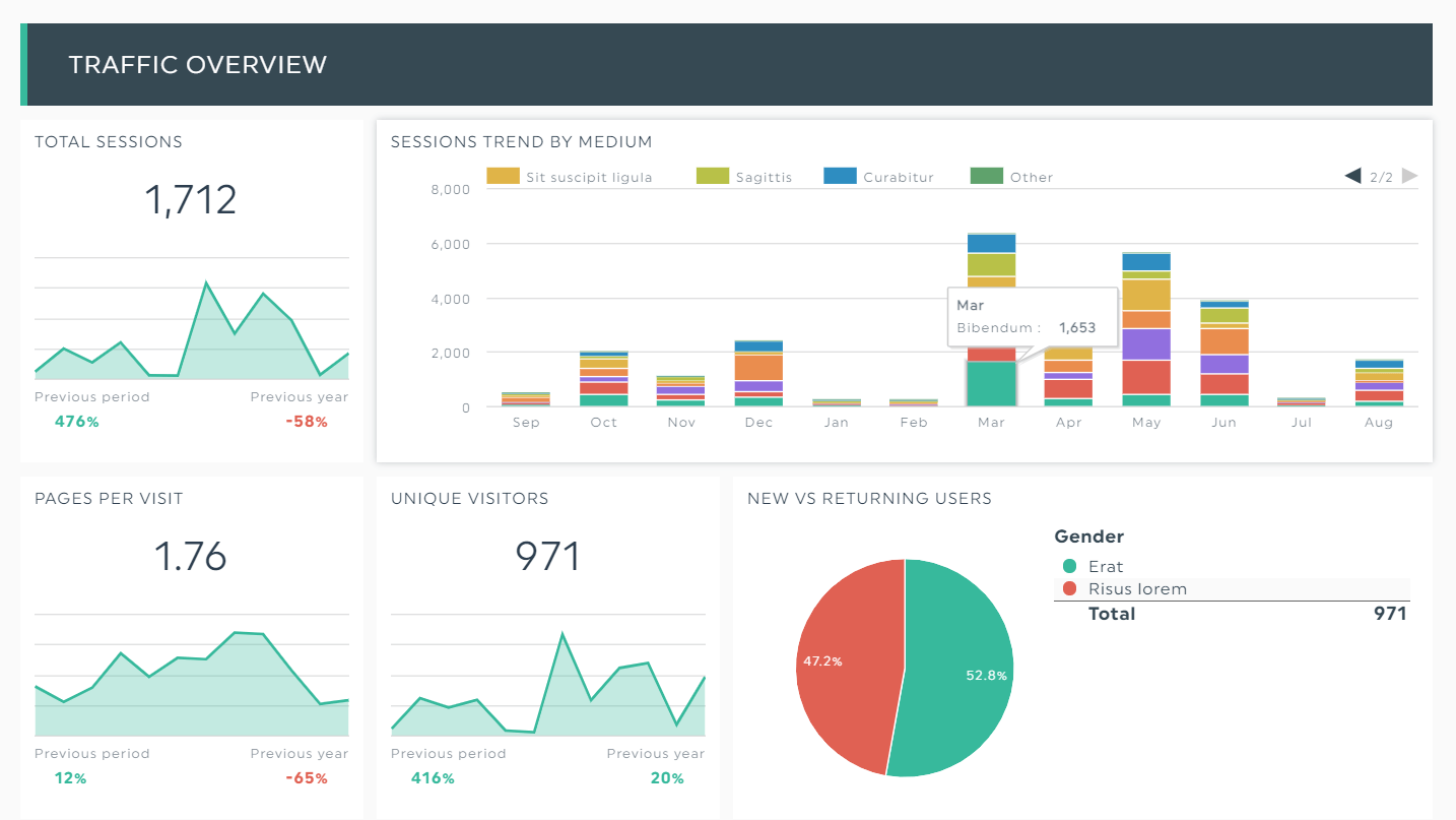
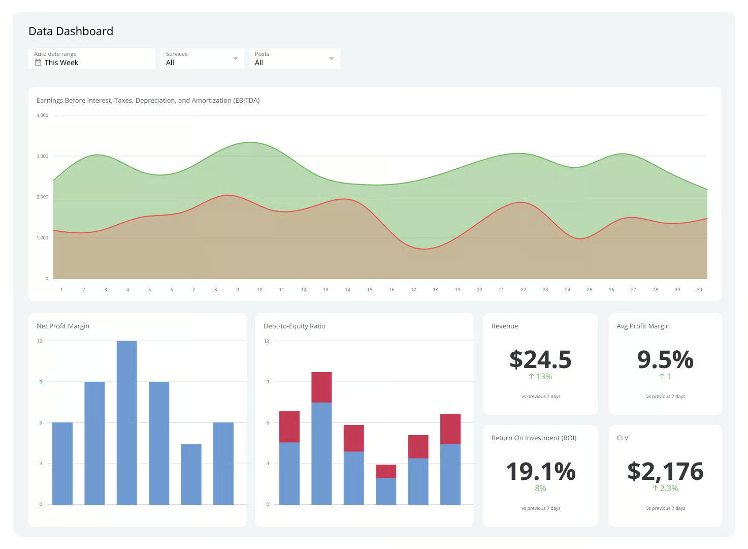
Data visualization dashboards render data in charts for communication and analysis. The distinguishing features of these dashboards are:
- They are designed to be interacted with, unlike a static image of a chart.
- They can connect multiple data sources and are separate from where the data is stored, unlike something like a chart in an Excel spreadsheet.
- They can combine multiple charts, tables, and text, unlike a single chart.
- They automatically update as data updates, unlike a fixed image.
This technology roadmap is about dashboards and the technology for building them, as opposed to any specific dashboard.
¶ 2. Design Structure Matrix (DSM) Allocation
This diagram shows how this technology intersects with other technologies at higher and lower levels of abstraction. Each of those other technologies could theoretically have its own roadmap. The absence of corresponding roadmaps on the MIT Tech Roadmaps site highlights gaps and opportunities for future team projects.
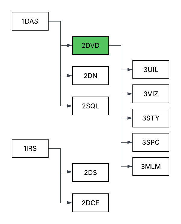
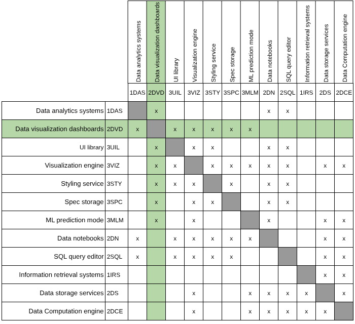
In reviewing the existing roadmaps, we found that while none directly address the construction or architectural integration of dashboard technologies, many instead focus on use cases and application domains that could potentially benefit from dashboards as enablers. For example, the Inventory Management System (2INV) roadmap illustrates a situation where data visualization dashboards could improve visibility and decision-making efficiency across inventory management and supply chain operations.
¶ 3. Roadmap Model using OPM
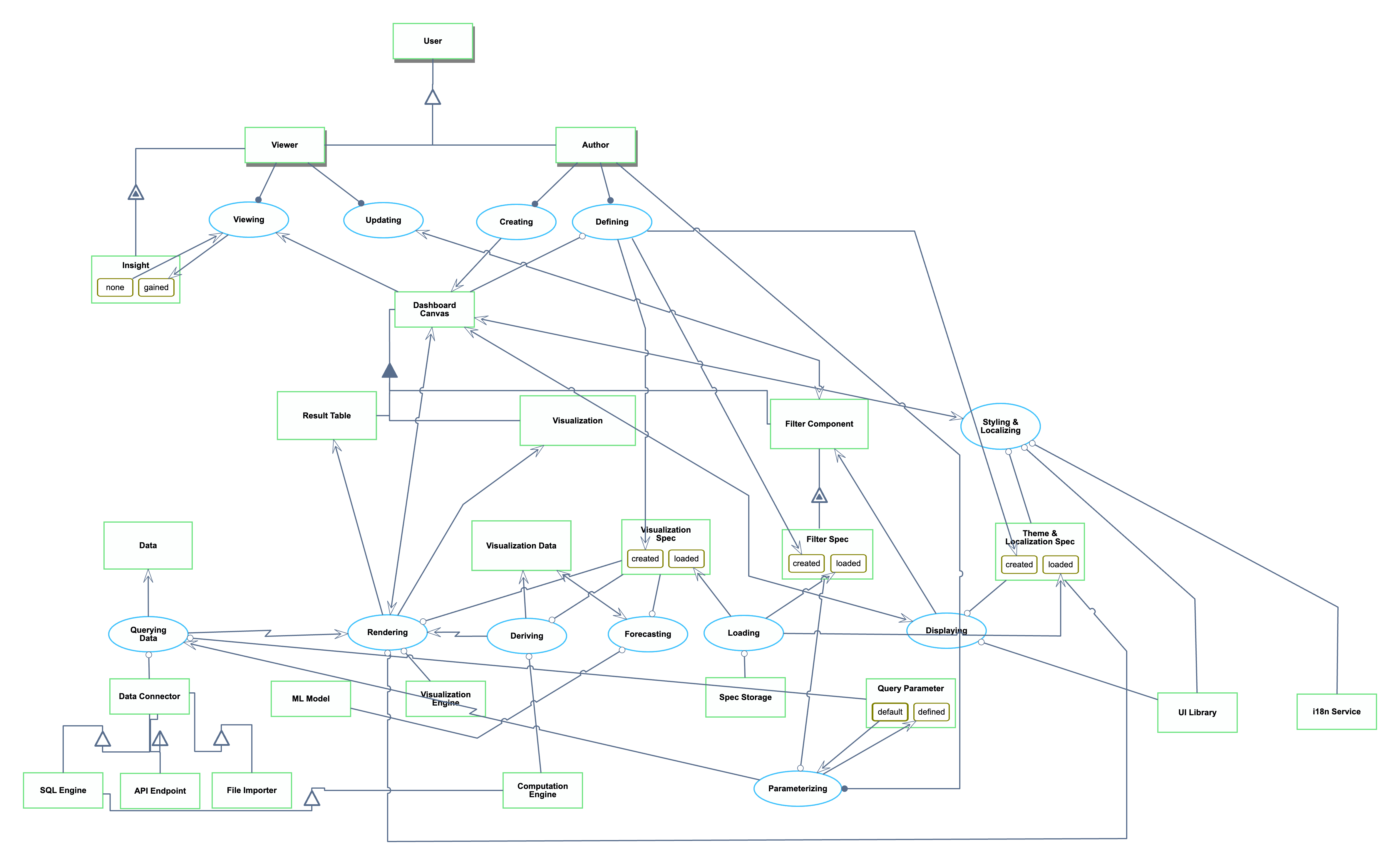
The OPL is repeated here for reference:
1. Data is an informatical and systemic object.
2. SQL Engine is an informatical and systemic object.
3. API Endpoint is an informatical and systemic object.
4. File Importer is an informatical and systemic object.
5. Data Connector is an informatical and systemic object.
6. Result Table is an informatical and systemic object.
7. Visualization Engine is an informatical and systemic object.
8. Dashboard Canvas is an informatical and systemic object.
9. Visualization is an informatical and systemic object.
10. Visualization Spec is an informatical and systemic object.
11. Visualization Spec can be created or loaded.
12. Visualization Data is an informatical and systemic object.
13. Spec Storage is an informatical and systemic object.
14. Filter Component is an informatical and systemic object.
15. Computation Engine is an informatical and systemic object.
16. Filter Spec of Filter Component is an informatical and systemic object.
17. Filter Spec of Filter Component can be created or loaded.
18. Query Parameter is an informatical and systemic object.
19. Query Parameter can be default or defined. State default is initial.
20. UI Library is an informatical and systemic object.
21. Theme & Localization Spec is an informatical and systemic object.
22. Theme & Localization Spec can be created or loaded.
23. i18n Service is an informatical and systemic object.24. ML Model is an informatical and systemic object.
25. User is a physical and systemic object.
26. Author is a physical and systemic object.
27. Viewer is a physical and systemic object.
28. Insight of Viewer is an informatical and systemic object.
29. Insight of Viewer can be gained or none.
30. Data Connector is a SQL Engine.
31. Data Connector is a API Endpoint.
32. Data Connector is a File Importer.
33. Dashboard Canvas consists of Filter Component, Result Table , and Visualization.
34. SQL Engine is a Computation Engine.
35. Filter Component exhibits Filter Spec.
36. Author and Viewer are Users.
37. Viewer exhibits Insight.
38. Querying Data is an informatical and systemic process.
39. Querying Data requires Data Connector and Query Parameter.
40. Querying Data yields Data.
41. Querying Data invokes Rendering.
42. Loading is an informatical and systemic process.
43. Loading requires Spec Storage.
44. Loading yields Visualization Spec at state loaded, Filter Spec of Filter Component at state
loaded, and Theme & Localization Spec at state loaded.
45. Deriving is an informatical and systemic process.
46. Deriving requires Computation Engine and Visualization Spec.
47. Deriving yields Visualization Data.
48. Deriving invokes Rendering.
49. Rendering is an informatical and systemic process.
50. Rendering requires Theme & Localization Spec, Visualization Engine, and Visualization Spec.
51. Rendering affects Dashboard Canvas.
52. Rendering yields Result Table and Visualization.
53. Displaying is an informatical and systemic process.
54. Displaying requires Theme & Localization Spec and UI Library.
55. Displaying affects Dashboard Canvas.
56. Displaying yields Filter Component.
57. Parameterizing is an informatical and systemic process.
58. Parameterizing changes Query Parameter from default to defined.
59. Author handles Parameterizing.
60. Parameterizing requires Filter Spec of Filter Component.
61. Parameterizing invokes Querying Data.
62. Styling & Localizing is an informatical and systemic process.
63. Styling & Localizing requires Theme & Localization Spec, UI Library, and i18n Service.
64. Styling & Localizing affects Dashboard Canvas.
65. Forecasting is an informatical and systemic process.
66. Forecasting requires ML Model and Visualization Spec.
67. Forecasting affects Visualization Data.
68. Defining is an informatical and systemic process.
69. Author handles Defining.
70. Defining requires Dashboard Canvas.
71. Defining yields Visualization Spec at state created, Filter Spec of Filter Component at state
created, and Theme & Localization Spec at state created.
72. Creating is an informatical and systemic process.
73. Author handles Creating.
74. Creating yields Dashboard Canvas.
75. Viewing is an informatical and systemic process.76. Viewing changes Insight of Viewer from none to gained.
77. Viewer handles Viewing.
78. Viewing consumes Dashboard Canvas.
79. Updating is an informatical and systemic process.
80. Viewer handles Updating.
81. Updating affects Filter Component.
¶ 4. Figures of Merit (FOM)
| Figure of Merit | Definition | Units of Measurement | Why It Matters | Trend |
|---|---|---|---|---|
| Maximum Supported Data Size | Maximum rows* of data that could be loaded and rendered on a dashboard. | Rows | Provides a concrete understanding of a dashboard technology’s scalability upper bound. | Increasing slowly |
| End-To-End Load Time | Time from opening the benchmark dashboard** to all visualizations fully rendered and interactive. To control for randomness, this is measured as the 95th percentile (p95) of attempts to load the same benchmark dashboard. | Seconds (s) |
Reflects first impression performance. Slow dashboard loads might cause user frustration. |
Relatively constant |
| Interaction Latency |
Time for applying a standard filter on the benchmark dashboard** to all visualizations being fully updated and interactive. Record 95th percentile latency. |
Seconds (s) |
Captures responsiveness of dashboards for user exploration. High latency might discourage data exploration and analysis. |
Relatively constant |
| Connector Breath | Number of distinct data storage services supported natively. | Count | Shows applicability of dashboards across a data ecosystem. | Increasing slowly |
| Price | Recurring cost of a license. To standardize across product tiers, this measures the price of the cheapest license that includes both creating and viewing visualizations. | Dollars per user per month | Organizations are less willing to pay for more expensive tools. | Increasing slowly |
| Chart Variety | Number of different types of charts that can be created, including sub-types. Four different examples are “bar chart”, “scatterplot”, “scatterplot with variable-size points”, and “histogram”. | Count | More chart variety means the dashboard technology allows more flexible ways to express the same data. | Stagnating |
* We use the number of rows as the unit since it is more intuitive to business intelligence (BI) users than raw byte size. For example, Databricks AI/BI Dashboard documents its dashboard export limit as 100,000 rows.
** Benchmark dashboard: Contains 6 visualizations (1 table, 1 pivot table, 1 bar chart, 1 line chart, 1 scatter plot, 1 map) on a dataset of 100K rows X 20 columns.
¶ FOM Trend Over Time
We selected Chart Variety as the figure of merit (FOM) to analyze because the number of available chart types directly affects how effectively a data visualization dashboard can represent complex information. A broader variety of chart types reflects greater expressiveness and flexibility for users, making this metric a good indicator of product maturity and innovation focus.
To illustrate this trend, we present two complementary visualizations:
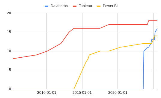
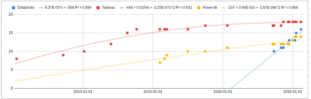
From these visualizations, we observe that Tableau and Power BI have largely plateaued in chart variety, reflecting their maturity and already comprehensive coverage of common visualization types. Databricks, on the other hand, shows a more rapid increase in chart options, though most additions appear focused on achieving feature parity with competitors rather than introducing new visualization paradigms.
Overall, this pattern suggests that the Chart Variety FOM is in a stagnation phase—the rate of innovation has slowed, and vendors now compete more on interactivity, performance, and user experience rather than on expanding the number of available chart types.
¶ 5. Alignment of Strategic Drivers: FOM Targets
These are example goals of a hypothetical company, not real goals of any specific company. The format is adapted from Table 8.3 on page 228 of the textbook.
| # | Strategic driver | Alignment and targets | Commentary |
|---|---|---|---|
| 1 | To develop an end-to-end unified data management solution that scales to enterprise volume | The 2DVD roadmap will enable connecting 50M rows of data across 20 different connectors. | Modern enterprises have not only many rows of data, but also many different connectors. These numbers are reasonable based on our industry experience. |
| 2 | To develop a data visualization system whose latency is fast enough to never break the “flow” for power users | The 2DVD roadmap will target an end-to-end load time of 10s and interaction latency of 150ms for a large benchmark dashboard. | 10 seconds for load time is a weak FOM target, but in contrast, 150ms is a very difficult target to hit. 150ms avoids breaking the “flow” state (Nielsen). This mixing of a weak FOM target with a strong one shows the strategic driver towards lower interaction latency. |
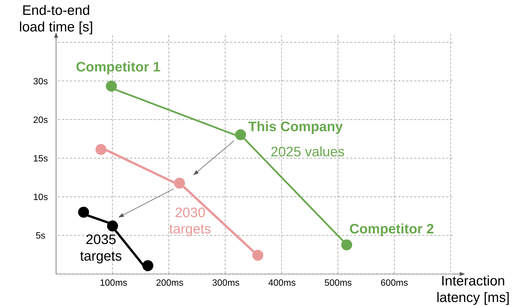
¶ 6. Positioning of Organization vs. Competition: FOM charts
Like section 5 above, these are example FOMs of hypothetical companies, not real FOM values of any specific company. For reference, this is similar to Figure 8.11 on page 229 of the textbook.
| Figure of Merit |
Maximum Supported Data Size [rows] |
Benchmark End-To-End Load Time [s] |
Benchmark Interaction Latency [ms] |
Connector Breath [-] |
Price [$/user/month] |
Chart variety [-] |
|---|---|---|---|---|---|---|
| Our company |
40M |
18 |
325 |
15 |
$15 |
14 |
| Competitor 1: Attacker and Pioneer |
60M |
30 |
100 |
30 |
$40 |
25 |
| Competitor 2: Low-Cost Provider |
10M |
4.5 |
520 |
10 |
$10 |
8 |
We can plot the FOMs of end-to-end Load time and interaction latency. These are in tension because implementations that lower interaction latency do so by loading more data up front, but that increases the initial load time. This chart shows how compared to us, Competitor 1 is ahead in interaction latency, but behind end-to-end load time. Competitor 1, as an attacker and pioneer, probably provides a more feature-rich product whose only downsides are price and up-front load time. Competitor 2, as a low-cost provider, provides a more lightweight product that initially loads more quickly but has to recompute lots of data on every interaction.
¶ 7. Technical Model: Morphological Matrix and Tradespace
¶ Morphological Matrix
The following morphological matrix outlines the major design decisions that influence the key Figures of Merit (FOMs) identified for the data visualization dashboard system. Each design dimension represents a distinct subsystem or architectural choice within the dashboard workflow, from data access to visualization delivery.
Note that many of these design choices affect Price in different ways, whether through higher development effort, infrastructure demand, or maintenance overhead that ultimately influence customer pricing.
|
Design Dimension |
Option 1 |
Option 2 |
Option 3 |
Main FOMs Impacted |
| 1. Connector Ecosystem | Limited (few databases) | Broad (common DBs + APIs) | Extensible (SDK/custom connectors) | Connector Breadth, Price |
| 2. Data Source & Access | Direct SQL / CSV | Cloud warehouse (e.g., Snowflake, BigQuery) | Data lake (Delta, Parquet) | Max Supported Data Size, End-to-End Load Time, Price |
| 3. Query Processing & Computation | Single-node SQL engine | Distributed compute (e.g., Spark, Presto) | Cached or incremental queries | End-to-End Load Time, Interaction Latency, Price |
| 4. Visualization Library | Basic chart set | Rich built-in types | Plugin-based extensibility | Chart Variety, Price |
| 5. Visualization Rendering | SVG (React/Vega) | Canvas-based (Chart.js) | GPU/WebGL accelerated | Interaction Latency, Chart Variety, Price |
| 6. Interaction Model | Manual filters | Reactive bindings (auto updates) | Declarative cross-filtering | Interaction Latency, Chart Variety, Price |
| 7. Deployment & Pricing Model | Local desktop | SaaS (per-user pricing) | Cloud pay-as-you-go | Price, Connector Breadth |
¶ Tradespace
Given that nearly all of the above design decisions ultimately affect Price, and that the other key FOMs are all performance-based and often in tension with Price, we propose a tradespace defined by Price versus a composite utility score representing overall dashboard performance.
This composite utility score can be a normalized combination of the non-price FOMs (e.g., a weighted function of utility scores for Maximum Supported Data Size, End-to-End Load Time, Interaction Latency, Connector Breadth, and Chart Variety).
The tradespace will be examined in detail later. For now, we establish the composite utility score by relating it to the individual FOMs and their sensitivities to the parameters that govern them.
¶ FOM 1: End-To-End Load Time
¶ Governing Equations
We model the end-to-end load time as the sum of two components: the time required to query and retrieve data, and the time required to render the dashboard’s visual interface. This relationship is expressed as:
new.png)
Note: this is a simplified representation of the actual equation. In practice, additional factors such as data transfer time between the server and the client, data serialization/deserialization overhead, and front-end initialization time would also contribute to total load time. However, we focus our analysis on the two dominant components, breaking them down further to stay within the suggested parameter count (2–4) and highlight the most influential contributors.
¶ Query Time
Query time is further defined by the governing relationship:
new.png)
where V(Data) denotes the data size, and S(Scan) represents the rate at which the system can scan and process that data.
Note: the scan speed S(Scan) could itself be modeled as a function of the system’s raw processing speed and the complexity of the query, including the number of aggregations, groupings, distinct operations, or joins in the query, since these factors increase computational overhead and reduce throughput. For this analysis, we focus on the most fundamental parameters to maintain a clear and tractable model.
¶ Render Time
Render time is further defined by the governing relationship:
.png)
where t(i) represents the average render time per mark for that visualization type, and N(i) is the number of visual marks of visualization type i (e.g., bars, points, lines).
Note: this equation captures differences in rendering complexity across mark types. For instance, dense scatter plots or layered charts typically incur higher per-mark render times compared to simpler bar or text-based marks. We assume rendering occurs concurrently across mark types but sequentially within (i.e., per mark), which is a simplification of real-world parallel-rendering behavior to keep the model tractable.
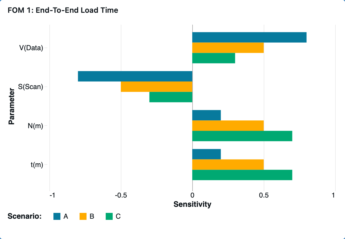
¶ Sensitivity Analysis
| Param | Partial Derivative | Normalized Sensistivity |
.png) |
-d.png) |
-s.png)
|
.png) |
-d.png) |
-s.png)
|
-new.png) |
-d.png) |
-s.png)
|
-new.png) |
-d.png) |
-s.png)
|
1: m denotes the mark type corresponding to the maximum rendering time, where:
xn(m).png)
¶ “Tornado” Chart
The relative distribution between query time and render time fundamentally changes which parameters most strongly influence the end-to-end load time.
When data processing dominates, T(Query) ≫ T(Render), end-to-end load time becomes highly sensitive to data-side parameters such as data volume, V(Data), and scan throughput, S(Scan). Conversely, when visualization rendering dominates, T(Render) ≫ T(Query), end-to-end load time becomes more sensitive to front-end parameters such as per-mark render cost, t(i), and mark count, N(i).
The shape of this distribution depends on workload characteristics — larger datasets and complex queries increase T(Query), while denser or more layered visualizations increase T(Render). Therefore, system bottlenecks shift dynamically depending on both backend query load and frontend rendering complexity.
We model three representative dashboard scenarios to show how data scale and visualization complexity shift the balance between query and render time, shaping the sensitivities in the tornado chart.
| Scenario | Description | T(Query) / T(Load) | T(Render) / T(Load) |
| A |
Query-dominant: Large dataset, simple visualizations |
0.8 | 0.2 |
| B |
Balanced: Moderate data and visualization |
0.5 | 0.5 |
| C |
Render-dominant: Complex visualizations on modest data |
0.3 | 0.7 |
¶ FOM 2: Interaction Latency
¶ Governing Equations
We model the interaction latency as the sum of two components: the time required to interpret the user’s filter input into actionable system operations, and the time required to reload and update all dashboard visualizations accordingly. This relationship is expressed as:
.png)
¶ Interpret Time
Interpret time is further defined by the governing relationship:
.png)
where t(d) represents the average interpretation time per dataset, and N(d) is the number of datasets affected by the filter action.
Note: The interpretation time could be further modeled as the sum of per-dataset interpretation costs, each dependent on dataset characteristics, such as schema complexity, since these factors affect how quickly filter changes can be propagated. For this analysis, we approximate the total as a linear function using an average per-dataset time t(d) to simplify the model.
¶ Reload Time
Reload time is further defined by the governing relationship:
.png)
where fd represents the fraction of datasets affected by the filter, and TLoad corresponds to the end-to-end load time defined in FOM 1.
Note: In practice, the contribution of each dataset to total reload latency may vary depending on data volume, visualization distribution and complexity, or caching efficiency. For this analysis, we model reload time as a scaled fraction of the previously defined end-to-end load time T(Load) using a single proportionality factor f(d) for simplicity.
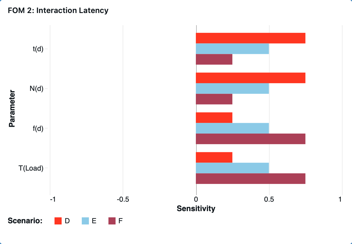
¶ Sensitivity Analysis
| Param | Partial Derivative | Normalized Sensistivity |
.png) |
-d.png) |
-s.png)
|
.png) |
-d.png) |
-s.png)
|
.png) |
-d.png) |
-s.png)
|
-sym.png) |
-d.png) |
-s.png)
|
¶ “Tornado” Chart
The relative distribution between interpretation time and reload time fundamentally changes which parameters most strongly influence the interaction latency.
When interpretation dominates, T(Interp) ≫ T(Reload), interaction latency becomes highly sensitive to interpretation-side parameters such as per-dataset interpretation time, t(d), and number of datasets affected (Nd). Conversely, when reload dominates, T(Reload) ≫ T(Interp), the system becomes more sensitive to reload-side parameters such as reload fraction, f(d) and end-to-end load time T(Load).
The shape of this distribution depends on dashboard workload characteristics — dashboards touching more datasets or involving complex filter logic increase TInterp, while those with broader or more data-intensive visual updates increase TReload. Therefore, system bottlenecks shift dynamically depending on both the query interpretation cost and front-end reload behavior.
We model three representative dashboard scenarios to show how interpretation complexity and reload scale shift the balance between interpretation and reload time, shaping the sensitivities in the tornado chart.
| Scenario | Description | T(Query) / T(Load) | T(Render) / T(Load) |
| D |
Interpretation-dominant: Complex cross-dataset filter applied to a small number of visualizations |
0.75 | 0.25 |
| E |
Balanced: Moderate filter on moderate number of visualizations |
0.5 | 0.5 |
| F |
Reload-dominant: Simple filter broadcast to many visualizations |
0.25 | 0.75 |
¶ 8. Financial Model: Technology Value (𝛥NPV)
¶ Company Positioning
Our company is a U.S.-based balanced attacker, combining traditional business intelligence with usage-based compute and AI-assisted features. This positioning allows us to innovate aggressively enough to capture high early growth while maintaining the operational discipline necessary for scaling efficiently. As we consider expanding our AI and analytics capabilities, the company faces a strategic decision about whether to maintain industry-typical investment levels or accelerate R&D and Sales & Marketing to capture a larger long-term opportunity
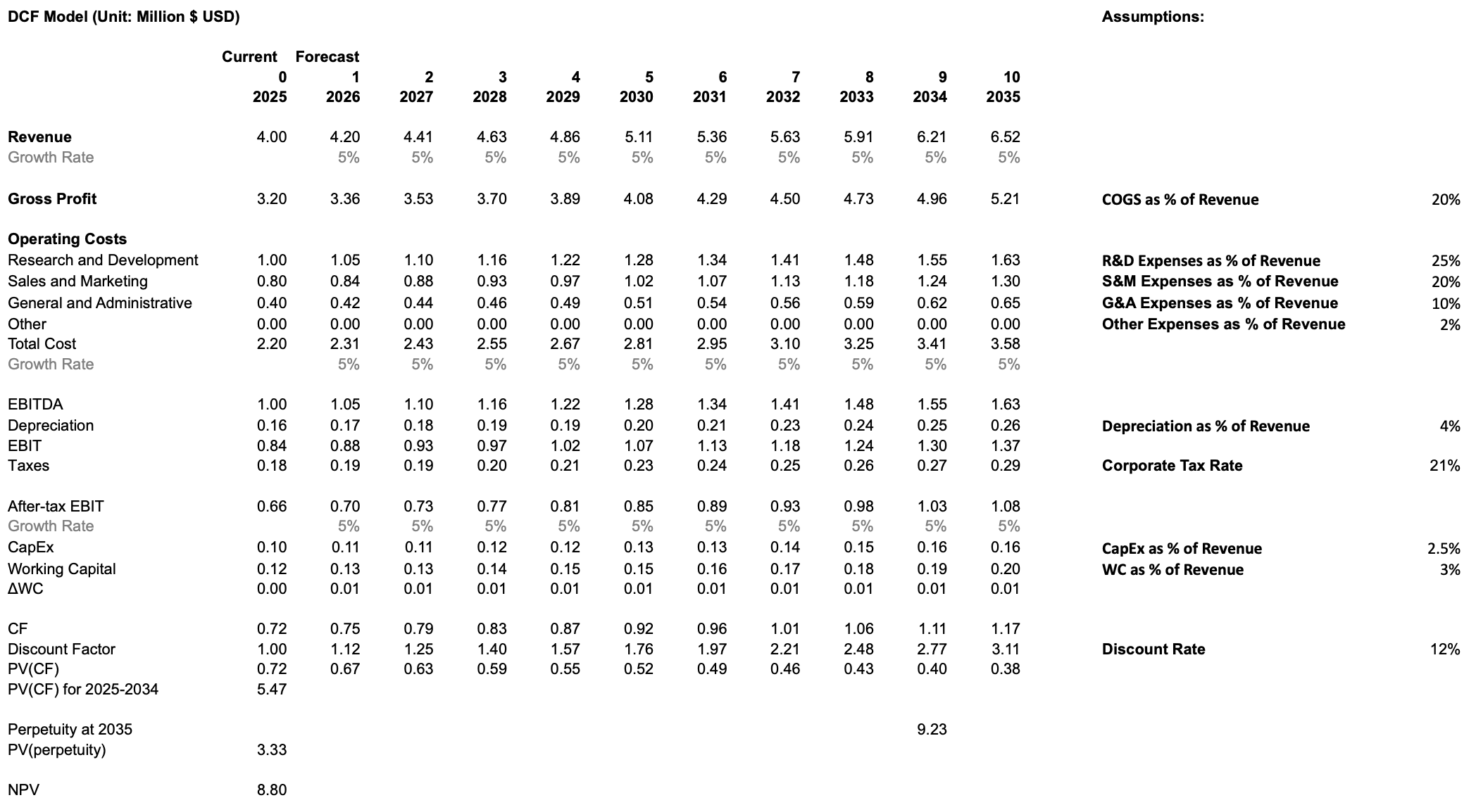
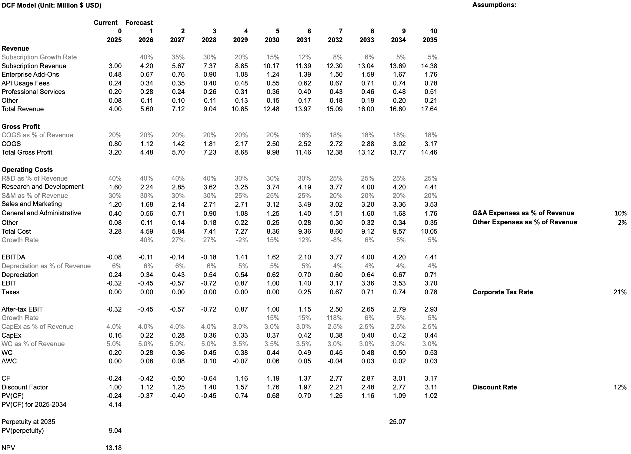
¶ Shared Assumptions Across Both Scenarios
Both scenarios rely on consistent underlying assumptions about the company’s operating environment:
- COGS follows BI/analytics benchmarks, producing gross margins that improve from the high-70% range to the low-80% range as the platform scales.
- Taxes are applied only once cumulative EBIT turns positive, assuming full utilization of net operating losses generated during early-stage deficits.
- CapEx and working capital remain modest and taper as a percentage of revenue over time, reflecting SaaS norms and improving operational efficiency.
- All cash flows are discounted using a 12% WACC, appropriate for an emerging but increasingly scaled AI/BI platform.
- Terminal value is estimated using a perpetuity growth model based on steady-state free cash flows and a long-run stable growth rate.
¶ Scenario 1: Industry-Norm Investment
In the baseline case, the company continues investing at levels consistent with BI and SaaS industry norms. R&D and Sales & Marketing remain moderate, supporting steady feature development and stable customer acquisition without materially altering the company’s competitive trajectory. Revenue growth remains modest, reflecting incremental improvements to the platform and the natural stickiness of enterprise BI adoption. This approach generates positive cash flows earlier, maintains controlled operating expenses, and produces a conservative free cash flow profile. Under these assumptions, the DCF yields an NPV of 8.80M, representing the value of the company if it continues along a typical, disciplined SaaS growth path.
¶ Scenario 2: Rapid Investment in R&D and Sales & Marketing
In the rapid growth case, the company front-loads investment into R&D to accelerate development of AI-assisted analytics, automation capabilities, and new compute-intensive features. Sales & Marketing intensity is also increased to rapidly scale adoption and capitalize on the output of these R&D initiatives. This strategy generates deeper negative free cash flows in early years due to higher operating expenses, but drives significantly higher long-term revenue growth, platform adoption, and competitive differentiation. Once operating leverage materializes in later years, the business achieves substantially larger steady-state free cash flows and a much higher terminal value. Under this accelerated investment profile, the DCF yields an NPV of 13.18M, indicating a materially higher long-term enterprise value relative to the status quo.
.png)
.png)
¶ Conclusion
The DCF comparison shows that aggressive early investment in R&D and Sales & Marketing, while costly in the short run, generates meaningfully higher long-term value. The rapid-investment scenario delivers an NPV of 13.18M versus 8.80M under the status quo, a 49% increase, demonstrating that accelerating innovation and go-to-market efforts create significantly more shareholder value. These results support pursuing a more ambitious investment strategy as the company scales its AI-driven analytics platform.
¶ 9. List of R&D Projects and Prototypes
| Name | Description | FOM Alignment | Benefits | Challenges | Risk-Level | Budget | Investment Decision |
| Advanced Chart Library Expansion | Adds missing advanced visualizations (violin plots, word clouds, sankey, sunburst, bullet, funnel) to support deeper analytical workflows. | Chart Variety | Enables richer statistical, flow, and hierarchical analysis; reduces need for external tools. | Ensuring visual quality, performance, and consistency across many new chart types. |
Low. Work is largely front-end with predictable engineering scope; primary risks involve QA and regressions. |
$0.25M–$0.50M 4–6 months of front-end engineering, UX design, and visual regression testing. |
Suitable for near-term investment given clear user value and modest scope. |
| Large-Scale Data Support Upgrade | Improves performance on multi-million–row datasets through optimized storage, query execution, and deeper warehouse compute pushdown. | Maximum Supported Data Size | Handles larger datasets with fewer slowdowns or timeouts; improves performance for growing enterprise workloads. | Backend complexity, warehouse-specific behavior differences, and extensive benchmarking across real-world dataset shapes. |
Medium. Performance gains vary significantly by customer environment and require deep backend optimizations. |
$0.6M–$1.2M 6–12 months of backend engineering, integration with major warehouses, and performance tuning. |
Best approached as phased improvements driven by observed customer dataset sizes and bottlenecks. |
| Visual Analytics Performance Optimization | Improves dashboard responsiveness by optimizing rendering, caching, and backend query execution. | End-to-End Load Time & Interaction Latency | Reduces dashboard load time, improves interaction smoothness, and enhances usability for complex dashboards. | Difficult to optimize consistently across varied dashboards, data shapes, caching semantics, and warehouse integrations. |
Medium. Performance behavior is highly workload-dependent and sensitive to small architectural changes. |
$0.8M–$1.6M 4–8 months of rendering optimization, caching redesign, backend tuning, and benchmarking infrastructure. |
Requires additional user data to pinpoint bottlenecks before defining scope. |
| AI Conversational Dashboard Builder | Adds a natural-language assistant that generates charts, queries, and dashboard components through conversational interaction. | Innovative capability (not in existing FOM set) | Improves usability, reduces manual configuration, increases effective chart variety, and speeds up exploration. | Ensuring accurate NL-to-query translation, safe responses, semantic-layer compatibility, and context handling. |
Medium. Depends heavily on model accuracy and correct interpretation across diverse datasets. |
$1.0M–$2.0M LLM integration, semantic-layer mapping, guardrails, and conversational interface engineering. |
A strong candidate for investment due to differentiation potential and broad usability impact. |
| AI Predictive Insights Model | Adds forecasting, anomaly detection, and scenario modeling directly within dashboards. | Innovative capability (not in existing FOM set) | Provides forward-looking insights, improves decision-making, and adds analytical depth without external tools. | Varied dataset quality, seasonality issues, noise, model drift, and explaining prediction logic to users. |
Medium–High. Forecasting accuracy is highly dataset-dependent and requires safeguards to maintain trust. |
$1.5M–$3.0M Time-series pipelines, anomaly detection, benchmarking, and integration work. |
A compelling investment opportunity but requires careful rollout and accuracy monitoring. |
| AI Business Review Generator | Automatically generates summaries, trend highlights, anomaly explanations, and business review narratives from dashboard data. | Innovative capability (not in existing FOM set) | Reduces manual analysis, provides digestible insights, and supports executive reporting workflows. | High accuracy and trust requirements; risk of incorrect or misleading narratives; complex evaluation and guardrails needed. |
High. Narrative mistakes can mislead users, especially when summaries are consumed without dashboard context. |
$2.0M–$4.0M NLG integration, metric-to-language mapping, template creation, and evaluation tooling. |
Deferred until earlier AI features prove reliable and generate strong user adoption. |
¶ 10. Key Publications, Presentations and Patents
This roadmap is informed by the following publications and patents.
¶ 10.1 Publications & Presentations
- Data Dashboard as Evaluation and Research Communication Tool
- Authors: Smith, Veronica S
- Description: This paper overviews the history of evolutionary computation and visualization, showing how visualization helps understand and guide the evolutionary process.
- Relevance to data visualization dashboards: This paper explains the historical context of using visualization to understand complex data. Dashboards are a modern tool for this purpose, and understanding the history of data visualization helps in designing better dashboards. The paper also discusses how visualization can make complex processes, like evolutionary algorithms, transparent and understandable, a core goal of data visualization dashboards.
- A Business Intelligence Dashboard Design Approach to Improve Data Analytics and Decision Making
- Authors: Dmytro Orlovskyi and Andrii Kopp
- Description: This paper proposes a design approach for business intelligence dashboards. It focuses on selecting appropriate data visualizations based on dataset size.
- Relevance to data visualization dashboards: This paper provides a structured, two-phase approach for preparing and analyzing data to recommend suitable visualizations. This is directly applicable to building dashboards that are both visually appealing and effective for business decision-making.
- Guiding the Choice of Learning Dashboard Visualizations: Linking Dashboard Design and Data Visualization Concepts
- Authors: Gayane Sedrakyan, Erik Mannens, and Katrien Verbert
- Description: This paper proposes a model connecting dashboard design principles with data visualization concepts to recommend effective visual representations of data.
- Relevance to data visualization dashboards: This article is highly relevant as it directly tackles a fundamental challenge in dashboard design: choosing the appropriate visualization. It provides a conceptual model and a set of recommendations to guide developers in creating more effective and less misleading dashboards, specifically in the context of learning analytics. The principles can be generalized to other types of dashboards as well.
¶ 10.2 Patents
- Data visualization in a dashboard display using panel templates (US11216453B2)
- Inventors: Michael Joseph Papale, Mark A. Groves
- Current Assignee: Splunk Inc., Cisco Technology Inc.
- CPC Classification (Primary):
- G06F 16/245: Query processing
- G06F 16/248: Presentation of query results
- G06Q 10/06: Resources, workflows, human or project management; Enterprise or organisation planning; Enterprise or organisation modelling
- Description: This patent describes a system for creating customizable interactive dashboards using pre-defined, reusable "panel templates" that users can arrange.
- Relevance to data visualization dashboards: This patent outlines a modular and user-friendly framework for building and interacting with data visualization dashboards. The use of panel templates allows for easy customization and reuse of components, which is a key aspect of modern dashboard design. The ability to have both local and global inputs for filtering and interaction is also a key feature of powerful dashboards.
- Systems and methods for data visualization, dashboard creation and management (US20200301939A1)
- Inventors: Tom Hollander, Eliot Horowitz, Thomas Rueckstiess
- Current Assignee: MongoDB Inc
- CPC Classification (Primary):
- G06F 16/258: Data format conversion from or to a database
- G06F 16/254: Extract, transform and load [ETL] procedures, e.g. ETL data flows in data warehouses
- G06F 16/2471: Distributed queries
- G06F 16/24556: Aggregation; Duplicate elimination
- G06F 16/284: Relational databases
- Description: This patent describes a system with a visualization layer integrated with a database for creating charts and visualizations.
- Relevance to data visualization dashboards: This patent details the creation and management of data visualization dashboards. It covers the entire lifecycle of a dashboard, from creation and data integration to user management and sharing. The focus on security and performance through a sophisticated permissions model and caching architecture is also a critical aspect of enterprise-grade dashboarding solutions.
- Systems and methods for generating data visualization dashboards (US9727836B2)
- Inventors: Troy A. Marchand, Ravindar A. Bhavnani, Adrian Serban Dobrin, Terrence Eugene Sheflin, Robert E. Siklos
- Current Assignee: Insightsoftware International Inc, Simba Technologies Inc
- CPC Classification (Primary):
- G06Q 10/06393: Score-carding, benchmarking or key performance indicator [KPI] analysis
- G06Q 10/06: Resources, workflows, human or project management; Enterprise or organisation planning; Enterprise or organisation modelling
- G06Q 10/067: Enterprise or organisation modelling
- Description: This patent describes a business intelligence system for users to create data visualizations of Key Performance Indicators (KPIs) by selecting data, charts, and filters.
- Relevance to data visualization dashboards: This makes a very broad claim, seeming to cover nearly any dashboard that renders KPI data.
¶ 11. Technology Strategy Statement
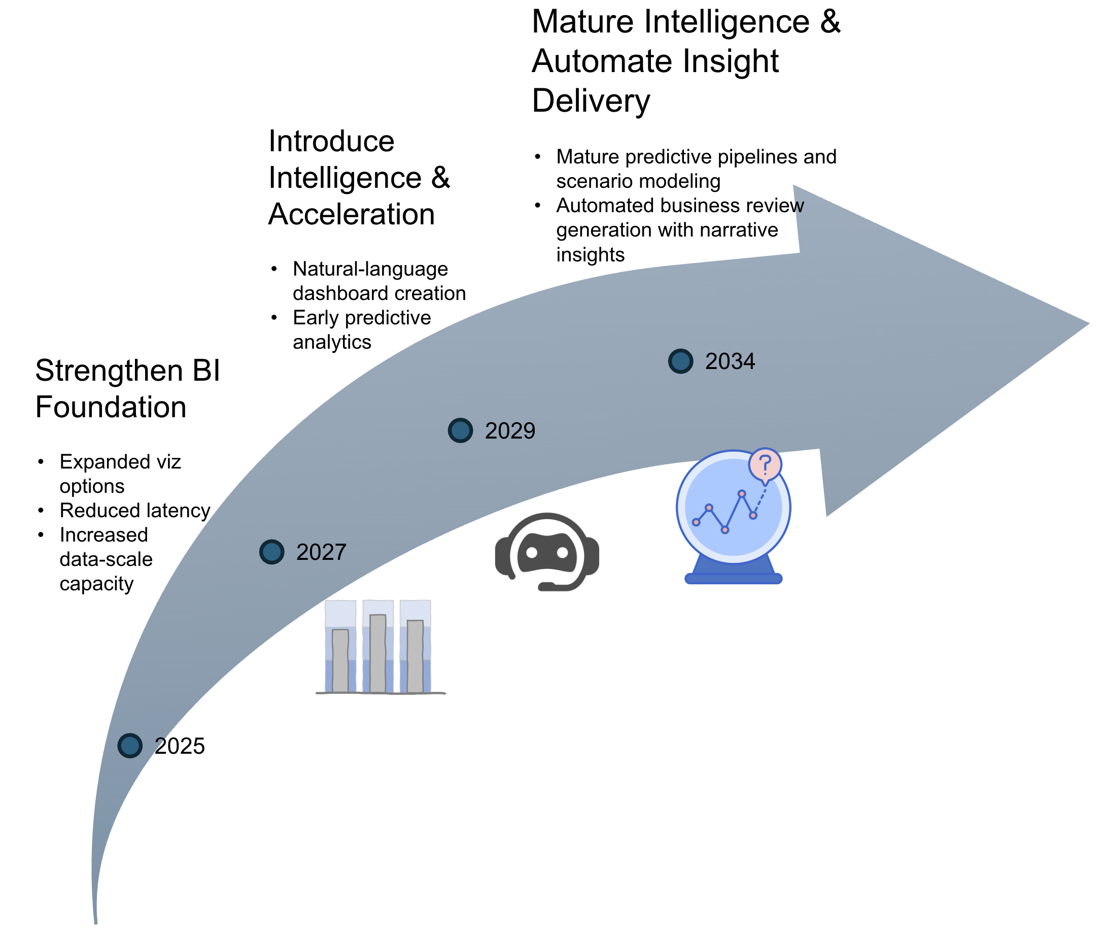
Initial efforts center on reinforcing the BI foundation through richer visualizations, better performance, and improved data-scale capacity. These upgrades enable more complex analytical workloads and set the stage for intelligence-driven capabilities. The mid-stage focus introduces natural-language dashboard creation and early predictive models that accelerate the path to insight. The long-term emphasis moves toward mature forecasting pipelines and automated business review generation. This progression reflects a deliberate move from foundational enhancements to increasingly automated and insight-driven analytics, with each stage enabling the next.
¶ 12. Roadmap Maturity Assessment (optional)
¶ 13. References
Cofsky, Amanda. “Power BI Desktop July Feature Summary.” Microsoft Power BI Blog, 18 Mar. 2021, powerbi.microsoft.com/en-us/blog/power-bi-desktop-july-feature-summary-2.
Databricks. “Announcing the Public Preview of Lakeview Dashboards.” Databricks Blog, 28 Sept. 2023, https://www.databricks.com/blog/announcing-public-preview-lakeview-dashboards.
Databricks. “Databricks AI/BI Release Notes 2024.” Databricks Documentation, 2024, https://docs.databricks.com/aws/en/ai-bi/release-notes/2024.
Databricks. “Databricks AI/BI Release Notes 2025.” Databricks Documentation, 2025, https://docs.databricks.com/aws/en/ai-bi/release-notes/2025.
Databricks. “Databricks SQL Release Notes 2023.” Databricks Documentation, 2023, https://docs.databricks.com/aws/en/sql/release-notes/2023.
Databricks. “Databricks SQL Release Notes 2024.” Microsoft Learn, 2024, https://learn.microsoft.com/en-us/azure/databricks/sql/release-notes/2024.
Domo. “Utilize Data Automation for Streamlined Reporting.” Domo Learn, https://www.domo.com/learn/article/utilize-data-automation-for-streamlined-reporting.
Domo. “Data Never Sleeps 9.0.” Domo Learn, https://www.domo.com/learn/infographic/data-never-sleeps-9.
FinancialModeling.tech. “Industry-Specific Discount Rates: WACC & DCF Valuation.” Accessed October 2025. https://financialmodeling.tech/learnings/discounted-cash-flow/industry-specific-discount-rates?utm_source=chatgpt.com.
Flaticon. “Prediction Icon.” Accessed October 2025. https://www.flaticon.com/free-icon/prediction_9304477.
FreeSVG. “Bullet Graph Icon Vector.” Accessed October 2025. https://freesvg.org/1538298822.
LeBlanc, Patrick. “Power BI January 2025 Feature Summary.” Microsoft Power BI Blog, 10 July 2025, powerbi.microsoft.com/en-us/blog/power-bi-january-2025-feature-summary.
Mackinlay, Jock. “History of Tableau Innovation.” Tableau Public, 20 June 2025, public.tableau.com/app/profile/jmackinlay/viz/TableauInnovation/History.
Majidimehr, Ryan. “Power BI August 2023 Feature Summary.” Microsoft Power BI Blog, 28 Aug. 2023, powerbi.microsoft.com/en-us/blog/power-bi-august-2023-feature-summary.
Mosaic. “Research and Development Expenses.” Mosaic Blog, accessed October 2025. https://www.mosaic.tech/post/research-and-development-expenses?utm_source=chatgpt.com.
Narayana, Sujata. “Power BI Desktop May 2020 Feature Summary.” Microsoft Power BI Blog, 19 May 2020, powerbi.microsoft.com/en-us/blog/power-bi-desktop-may-2020-feature-summary.
Nielsen, Jakob. “Response Times: The 3 Important Limits.” Nielsen Norman Group, January 1993, accessed October 2025. https://www.nngroup.com/articles/response-times-3-important-limits/.
Orlovskyi, Dmytro, and Andrii Kopp. A Business Intelligence Dashboard Design Approach to Improve Data Analytics and Decision Making. https://ceur-ws.org/Vol-2833/Paper_5.pdf.
Power BI Team. “Announcing Power BI General Availability Coming July 24th.” Microsoft Power BI Blog, 10 July 2015, powerbi.microsoft.com/en-us/blog/announcing-power-bi-general-availability-coming-july-24th.
Power BI Team. “Visual Awesomeness Unlocked – Box-and-Whisker Plots.” Microsoft Power BI Blog, 28 Jan. 2016, powerbi.microsoft.com/en-us/blog/visual-awesomeness-unlocked-box-and-whisker-plots. Accessed 27 Sept. 2025.
Power BI Team. “Visual Awesomeness Unlocked – Sankey Diagram.” Microsoft Power BI Blog, 11 Dec. 2015, powerbi.microsoft.com/en-us/blog/visual-awesomeness-unlocked-sankey-diagram. Accessed 27 Sept. 2025.
PwC. “United States: Corporate Income Tax.” Tax Summaries by PwC, accessed October 2025. https://taxsummaries.pwc.com/united-states/corporate/taxes-on-corporate-income?utm_source=chatgpt.com.
SaaS Capital. “Spending Benchmarks for Private B2B SaaS Companies.” SaaS Capital Blog, accessed October 2025. https://www.saas-capital.com/blog-posts/spending-benchmarks-for-private-b2b-saas-companies/?utm_source=chatgpt.com.
Sedrakyan, Gayane, Erik Mannens, and Katrien Verbert. “Guiding the Choice of Learning Dashboard Visualizations: Linking Dashboard Design and Data Visualization Concepts.” Journal of Computer Languages 50 (February 2019): 19–38. https://doi.org/10.1016/j.jvlc.2018.11.002.
Smith, Veronica S. “Data Dashboard as Evaluation and Research Communication Tool.” New Directions for Evaluation2013, no. 140 (2013): 21–45. https://doi.org/10.1002/ev.20072.
Splunk Inc. “Data Visualization in a Dashboard Display Using Panel Templates.” U.S. Patent 11,216,453 B2. Filed August 30, 2019. Issued January 4, 2022. Accessed October 2025.
Storytelling with Data. “What Is a Bullet Graph?” Storytelling with Data Blog, accessed October 2025. https://www.storytellingwithdata.com/blog/what-is-a-bullet-graph.
Tableau Software Inc. “System and Method for Generating Interactive Data Visualizations.” U.S. Patent 9,727,836 B2. Filed July 21, 2015. Issued August 8, 2017. Accessed October 2025.
Tableau Software Inc. Form 10-K Annual Report 2018. U.S. Securities and Exchange Commission, https://www.sec.gov/Archives/edgar/data/1303652/000130365219000007/a10k2018.htm.
Salesforce Inc. “Systems and Methods for Generating and Displaying a Dashboard.” U.S. Patent Application 2020/0301939 A1. Filed March 20, 2020. Published September 24, 2020. Accessed October 2025.